This is my step-by-step, photographic evidence of my web design
Here I have chosen which website theme I want, I have chosen the 'PLAY' one as I liked the font of the text and I used the colour as inspiration for the colours I actually chose.

This is one style of design I chose as I liked the look of the different sections.
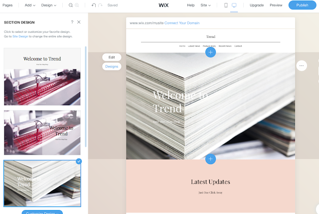
This is the design I chose as I like how the text overlaps/blends in with the background photo.
In the pictures above and below I used example pictures to visualise what my webpage would look like with my own photos on it.

I then used an example picture to see what it would look like against my chosen design, to see if I like the way it loos and I think it looks good how the text is over the picture. I have also changed the sub-heading to '24/7 FASHION' and added the company email to the web design, as it looks more professional.
This is my chosen design for the middle of the age, where I will include a few news stories, to resemble the general fashion magazines, I also chose which colour I wanted and I'm happy wit this colour scheme as it suits a female magazine.
This is the bottom of my home page on my web design, I have chosen to keep the 'contact us' bit as it helps it look professional and it means audiences can interact.


 This is one style of design I chose as I liked the look of the different sections.


